
Lunera is the handmade candle and soap store I built and did the SEO for. It is owned by my sister. The first version worked and Google could read it, but the first screen did not show the products well. This post shows what changed, why, and what a design like this means for page speed. The full story of the store is in the Lunera case study.
Why I redesigned the first screens
In the old hero the photos were small and tilted, scattered around the logo. A visitor saw the name first and the products second. On the collection page, one large candle sat on the right, with a faint word behind it, and the other candles were further down. For a store that sells things people want to see, I wanted the products to show up in the first screen, together with the way to buy.
The homepage hero, before and after
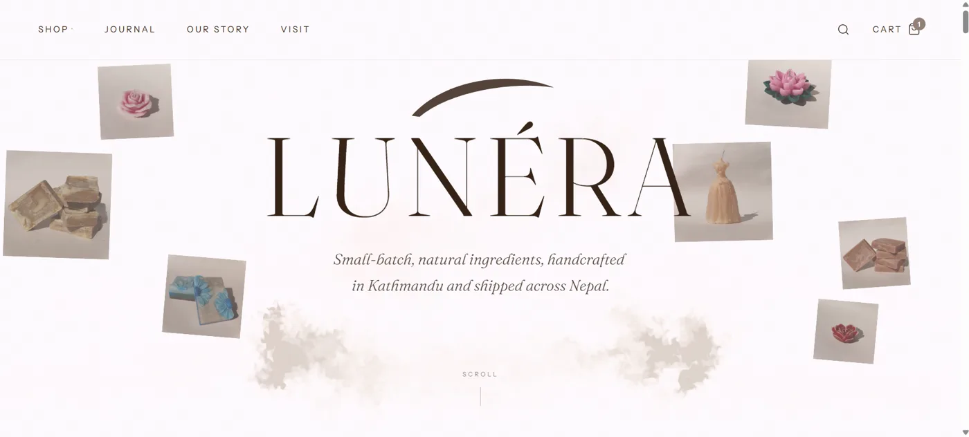
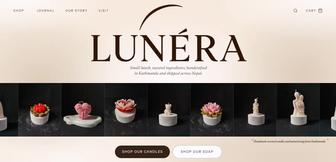
The new hero keeps the large wordmark and the tagline, then adds a full-width strip of product photos on dark backgrounds, running edge to edge. Under the strip are two buttons: Shop our candles and Shop our soap. Lunera sells two kinds of product, so the two buttons send each visitor straight to the right collection instead of making them hunt through a menu.
The product cards, before and after
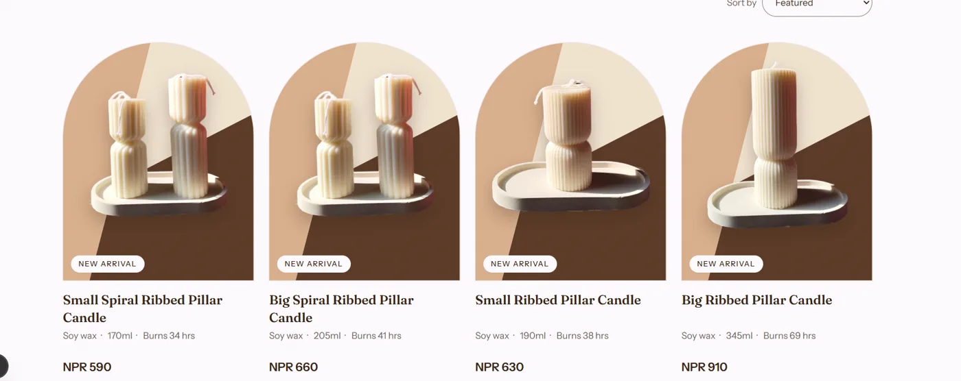
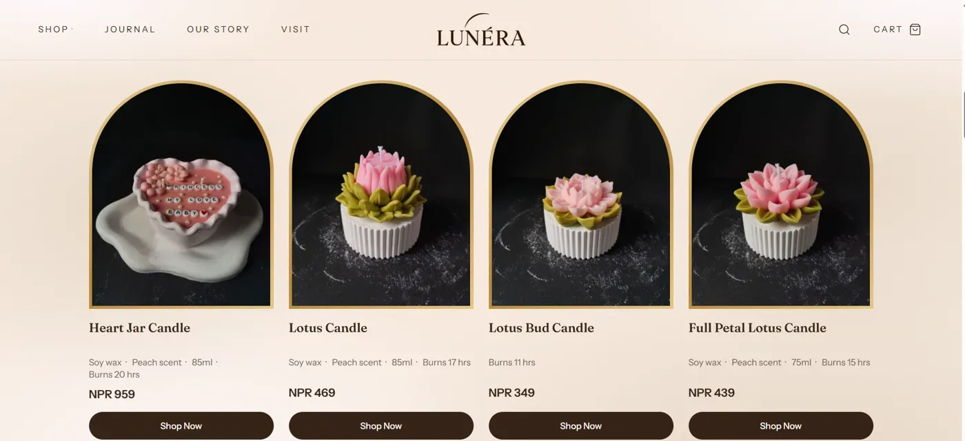
The old cards already used an arch for the photo and showed the name, a details line and the price. The new cards keep that order and change the look of the photo, and add a way to order. Each card now carries:
- The product photo in an arch-shaped frame with a thin gold border.
- The product name.
- The details line: wax, scent, size and burn time where we have them.
- The price in NPR.
- Two buttons: Shop Now and Order on WhatsApp.
The second button is there because Lunera takes orders both on the site and on WhatsApp, so each card offers both ways to buy.
The candles collection hero, before and after
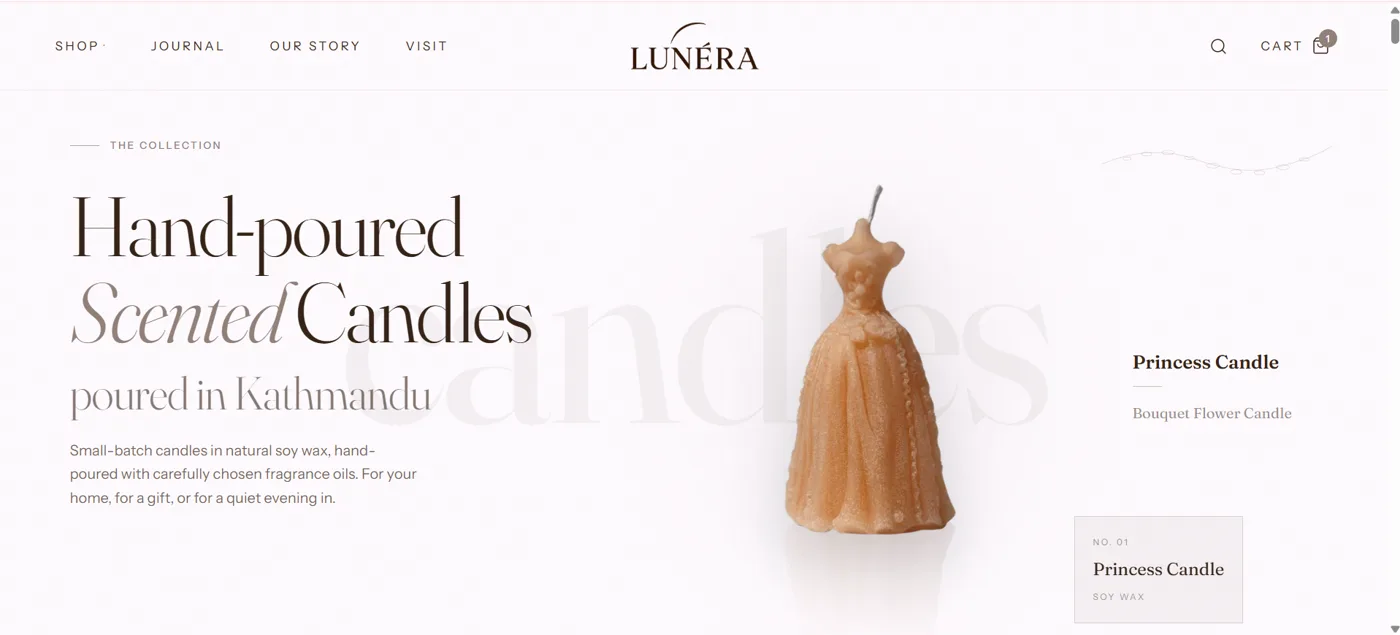
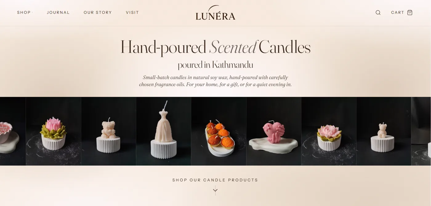
The heading, Hand-poured Scented Candles, poured in Kathmandu, stays the same. What changed is the picture: one large candle became a strip of different candles, so the visitor sees the range straight away. A small line, Shop our candle products, with an arrow leads down to the cards.
How I designed it
The inspiration came from several sites, but the layout itself I sketched by hand on paper first: where the brand goes, where the products go, and where the buttons sit. Drawing it first made the decisions quicker, because it is easy to rub out a line on paper and hard to rework a built page.
- 1Sketch on paperDraw the first screen by hand, many times.
- 2Decide what must showThe brand, the products and the buttons, all on the first screen.
- 3Build itRebuild the sections in the store, keeping the content and links.
- 4Measure itCheck LCP and the layout on a phone before judging the result.
What is LCP, and why does a photo hero matter?
Largest Contentful Paint measures when the largest image, text block or video visible on the screen is drawn, counted from when the visitor first asked for the page. Google's documentation says to aim for 2.5 seconds or less, measured at the 75th percentile of visits.
| LCP result | What it means |
|---|---|
| 2.5 seconds or less | Good |
| Between 2.5 and 4.0 seconds | Needs improvement |
| More than 4.0 seconds | Poor |
Only some things can be the LCP element: an image tag, an image inside an SVG, a video (its poster or first frame), an element with a CSS background image, and a block of text. This matters for a design like the new hero. When the first screen is made of photos, one of those photos is very likely the LCP element, so how quickly it loads decides the score. A text-only hero would be judged on its text instead.
LCP is made of four parts that add up to the total. A fast page needs all four to be small, because making the image smaller can simply move the delay somewhere else.
- 1Time to first byteHow long the server takes to start sending the page.
- 2Resource load delayTime before the browser starts to download the main image.
- 3Resource load durationHow long the image takes to download.
- 4Element render delayTime between the image arriving and it appearing on screen.
A checklist for a photo hero
These come from web.dev's guidance on optimizing LCP. They are what I check on a hero like Lunera's:
- The main photo is a normal image in the page
- It is not lazy-loaded
- Only one or two images get high priority
- Photos are the right size
- Nothing hides the hero while it loads
How I measure it
I start with real visitor data, from PageSpeed Insights or the Core Web Vitals report in Search Console, and use Lighthouse only to find the cause. If the two disagree, Google's guidance is that the real-visitor data is likely the more accurate one. I check the phone numbers first, because Google's thresholds are the same for phone and desktop and phones are usually the harder case to meet.
I have not put before and after LCP numbers in this post. Real-visitor data takes time to collect for a new design, and a lab test on one day is only a snapshot. I will add the numbers once I have them. A design change is also a bet about how people behave. Whether it brings more orders is something I will only know from the store's own data.
If you want a store design that looks good and loads fast, see ecommerce website design in Nepal and technical SEO in Nepal.